This week started off with permission management. Many tricky questions arose during the implementation and we tried to answer them as simply as possible. Besides this, a row of QoL improvements, like fuzzy search or smoother quick actions navigation, were implemented. All right, let’s crack this ice cream box open.

Teams
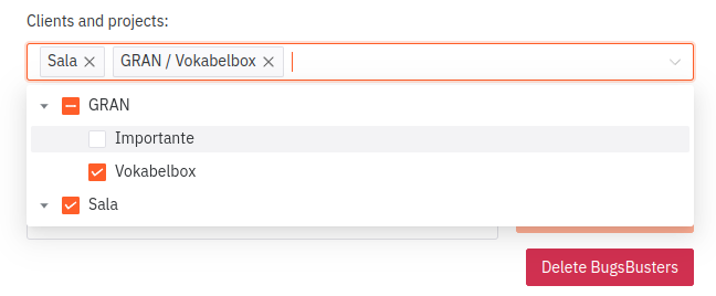
John has been working on the “Importante” project for decades. But now it’s finished and Tim, the manager, doesn’t want John to log time for “Importante” anymore.
What happens now?

Tim, most likely, will remove the access to the “Importante” project from John’s team.

Logically, no member of this team, including John, should see the “Importante” project, nor time entries logged for it.

Tim, his manager, will see it, sure. But John loses this data and the information gap between John and Tim grows and John cannot really reason about what he worked on.
Things get hairy if John is a freelancer and needs to export timesheets or simply wants to monitor his work.
As we see, it’s not the greatest solution but a great first step, nevertheless. We’re going to implement it like this, because it’s good enough. And it allows us to build on it and expand the permission system to become more sophisticated in the future.
How to do it?
Our current data model doesn’t necessarily make the task easy, though.
We want to do the following:
- check if any of the teams
- to which the user belongs
- has access to the project
- or client
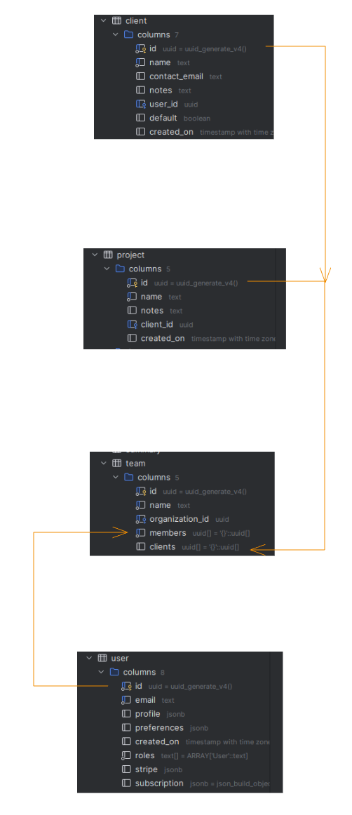
And our database schema looks like this:

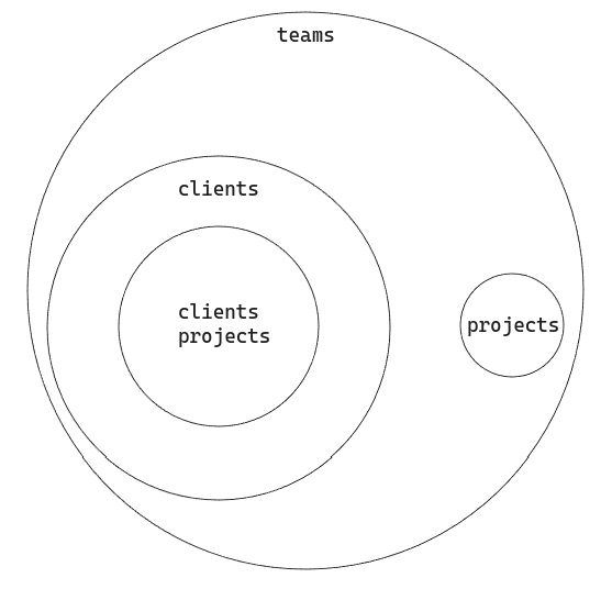
The graph below shows where data we’re interested in (projects) resides:

And it’s fairly easy to do with SQL. First, define which teams we are looking for (which client and which member). Then collect projects from those teams and clients.
with teams as (select id, name, clients from team where 'dd08d05c-fd2a-4f32-92f7-b3df994b286f' = ANY (team.members)),
    clients as (select client.id, client.name
                from client
                         join teams on client.id = any (teams.clients)),
    clients_projects as (select array_agg(project.id) as list from clients join project ON project.client_id = clients.id),
    projects as (select array_agg(project.id) as list from project join teams on project.id = any (teams.clients))
A little inconvenience we are facing here is the fact that the teams.clients column contains UUID of both projects and clients. It’s most certainly not the best approach, but it works for now and that’s all right.
Later you can filter your results:
AND (te.project_id = any(select unnest(list) from clients_projects)
   OR
   te.project_id = any(select unnest(list) from projects)
   OR
    te.project_id is null
)
QoL
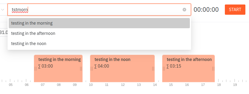
Fuzzy search in task descriptions! The autocomplete logic was very simple:
const options = computed(() => autocomplete.value.map(ac => {
    if (!description.value) return false
    if (!ac.toLowerCase().startsWith(description.value.toLowerCase())) return false;
    return {
        label: ac,
        value: ac,
    }
}).filter(i => i));
Very sophisticated 😊
But we switched over to fuse.js and now it’s much more interesting.

const options = computed(() => {
    if (!desc.value) return [];
    const fuse = new Fuse(autocomplete.value, {
        includeScore: true,
        minMatchCharLength: 3,
        useExtendedSearch: true,
    });

    return fuse.search(desc.value).map(f => {
        return {
            label: f.item,
            value: f.item,
        }
    });
})
Besides, we increased contrast in all of the select inputs to improve readability and improved flow while using quick actions. Previously it would require us to tap ESC to close it, now it’ll close automatically after an action is executed
What’s Next?
You can expect some more QoL improvements. We actively use the tool and plan some smaller tasks each week. Teams are our main focus now, but it’s a really big feature so we want to roll out some smaller updates too.
Some new screens of Teams and more details about implementation coming up, too.
Thank you for reading!
But don’t just read. Try it out now. It only takes 1 minute: consultingcockpit.com And with a 90 day trial, you can’t go wrong.
